

How to Annotate Trading Screenshots for Faster Learning
Learn how to annotate trading screenshots with structure, entry logic, and lessons. Raw screenshots teach nothing without markup.

A trading screenshot without annotation is a picture of noise. You took it because something happened, but two weeks later you cannot remember what. The screenshot sits in a folder, useless, alongside 200 others just like it.
Annotated screenshots are different. They capture your thought process, your entry logic, and the structural context that made the trade valid or invalid. They become the building blocks of a journal you can actually learn from.
TL;DR
Raw screenshots without markup teach you nothing when you review them later.
Annotate every screenshot with structure labels, zone identification, entry logic, and invalidation.
Use the three-timeframe screenshot system: higher for narrative, medium for zone, lower for trigger.
Write one key lesson on each annotated screenshot so review sessions have clear takeaways.
Annotation quality matters more than screenshot quantity.
Why Raw Screenshots Are Useless
Ever gone back to your screenshots folder after a month? You see dozens of charts with no context. Which pair? What timeframe? Why did you take this screenshot? Was this a win or a loss?
You cannot learn from data you cannot interpret.
The problem is not that you failed to take screenshots. The problem is that you captured the outcome without capturing the reasoning. A screenshot of a 15-minute GBP/USD chart tells you what price did. It does not tell you what you were thinking, what your plan said, or what you learned.
Sound familiar? Most traders have this exact folder. Hundreds of images, zero insights.
The fix is not more screenshots. It is better screenshots. Every chart you save needs to carry enough context that a future version of you (or someone reviewing your work) can reconstruct the entire trade idea in under 30 seconds.
What to Annotate on Every Chart Screenshot
Here is the minimum annotation set for every screenshot in your trading journal:
1. Trend and Structure. Mark the current trend direction. Label the most recent swing high and swing low. If there is a break of structure or market shift, draw it and label it. This takes 30 seconds and gives the screenshot immediate context.
2. Key Zones. Highlight the supply zone, demand zone, or flip zone that attracted your attention. Draw the zone boundaries. Label it with what it is: "Daily demand zone," "4H supply," "Flip zone from Wednesday."
3. Entry Logic. Write exactly why you entered (or why you would enter if forward testing). Not "it looked bullish." Instead: "BOS on 15M confirmed bullish shift. Entry at demand zone edge. Stop below zone. Target at swing high." Be specific enough that you could reconstruct the setup without the chart.
4. Invalidation. Mark the price level where your trade idea dies. "Below 1.2650, the bullish thesis is invalid." This forces you to define risk before you review the outcome.
5. One Lesson. After the trade plays out (or the forward test resolves), add one sentence: what did this trade teach you? "Zone held after liquidity sweep, confirming the sweep-and-reverse pattern." Or: "Zone failed because it was on the third touch. Avoid third-touch zones."
Walkthrough: Annotating a GBP/USD Setup
You screenshot the daily chart showing price in a downtrend with a recent bullish break of structure. You draw an arrow at the BOS point and label it "Daily BOS, bullish shift." You mark the demand zone at 1.2620 to 1.2645 and label it "Fresh daily demand, first touch."
On the 1-hour chart, you mark the pullback into the demand zone and label the lower-timeframe structure: "1H created LH, LL sequence into zone. Waiting for reversal."
On the 15-minute chart, you mark the market shift candle, label the flip zone, and draw the entry, stop, and target. Entry at 1.2640, stop at 1.2615, target at 1.2700.
Risk: 1.2640 minus 1.2615 = 25 pips. Reward: 1.2700 minus 1.2640 = 60 pips. R:R = 60 divided by 25 = 2.4R.
After the trade resolves, you add: "Lesson: entry at zone edge filled perfectly. Zone held on first touch with strong imbalance candle."
That one annotated set of screenshots teaches more than 50 raw screenshots stacked in a folder.
The Three-Timeframe Screenshot System
One screenshot per trade is not enough. You need three, one for each timeframe layer in your analysis. This is the same multi-timeframe approach you use during analysis, applied to documentation.
Higher Timeframe (Daily or 4H). This shows the narrative. Where is price in the overall range? What is the trend? Where are the major zones? This screenshot answers "Why am I looking for this type of trade today?"
Medium Timeframe (1H or 4H). This shows the zone. Where exactly is the point of interest? How did price approach it? Is there confluence with other factors like a liquidity sweep or imbalance? This screenshot answers "Where is the setup?"
Lower Timeframe (15M or 5M). This shows the trigger. What entry model confirmed the trade? Where is the break of structure or market shift? Where are the stop and target? This screenshot answers "How did I get in?"
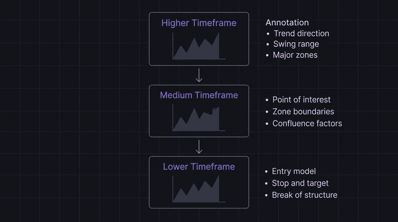
Store all three together. When you review them during your weekly review process, you want to see the complete story from narrative to trigger in one view.
Turning Annotations Into Lessons
Annotations are raw material. Lessons are the finished product.
At the end of each week, open your annotated screenshots and read through them. You are looking for patterns, not individual trades.
Pattern spotting questions:
Did you enter too early on any of these setups? (The annotation will show entry before confirmation.)
Did any zones fail? What was common about the failures? (Third touch? Wrong timeframe? No imbalance?)
Did your invalidation levels hold, or did price sweep them and reverse?
Were your R-multiples consistent, or wildly different each trade?
Write down the top two or three lessons from the week. These are specific, not generic. "Wait for 15M BOS before entering demand zones" beats "Be more patient." Keep these lessons in your post-trade review notes.
Walkthrough: A Week of Annotations Reveals a Problem
You review five annotated screenshots from the week. Three trades entered at the edge of the demand zone. Two worked. One failed when price swept through the zone and never reversed.
Looking closer at the failure, your annotation says: "Third touch of this zone. Previous two reactions were weaker each time." The two winners were both first-touch zones.
Lesson: "First-touch demand zones with imbalance are my highest win rate setup. Third-touch zones are low probability. Stop trading them." That is a concrete improvement to your plan, and you found it by reading your own annotations.
How EdgeFlo Stores Annotated Screenshots in Your Journal
EdgeFlo's trading journal stores multi-timeframe chart screenshots alongside your written notes. You can attach all three timeframe views to a single journal entry, add your annotation text, and tag the entry with your zone type, entry model, and outcome.
When you review your journal, the annotated screenshots load together with your trade data. You do not need to dig through a folder or match screenshots to spreadsheet rows. Everything lives in one place: the chart, the annotation, the R-result, and the lesson.
Over time, your annotated entries become a library of patterns. You can search by tag, filter by outcome, and find exactly the kind of setup you want to study. That is what turns random chart screenshots into a structured learning system.
What should I annotate on a trading screenshot?
How many timeframes should I screenshot per trade?
Should I annotate losing trades too?
What tools can I use to annotate trading screenshots?

Turn discipline on.
Every session.
EdgeFlo is the environment serious traders operate inside.
Start 7-Day Trial — $7
Cancel anytime.
No long-term commitment.


Think Different, Trade Different.