

Supply and Demand Zones Meet Liquidity: A-Grade Setups
Supply and demand zones gain power when liquidity pools sit nearby. Learn the extreme zone concept and the confluence checklist for A-grade entries.

You draw a perfect supply or demand zone. Price returns to it. And nothing happens. It slices straight through like the zone was never there.
This is the most frustrating experience in price action trading, and it happens because zones alone are not trade signals. A zone gains real power only when it sits next to untapped liquidity. That confluence between institutional order flow and resting orders is what separates zones that hold from zones that break.
TL;DR
A supply or demand zone without nearby liquidity is a coin flip, not a setup.
The extreme zone (the zone that caused the most recent break of structure) is the highest-probability location for a reaction.
Liquidity pools near a zone give institutions the fuel to fill positions, dramatically increasing the chance the zone holds.
An A-grade zone checks at least three boxes: it caused a BOS, it has nearby untapped liquidity, and it aligns with the higher-timeframe trend.
Use a confluence checklist before every zone-based entry to filter out low-probability trades.
Why Zones Alone Are Not Enough
Every swing point on a chart can be labeled as a supply or demand zone. The 15-minute chart is littered with them. If you trade every zone you draw, your win rate will hover around 40% to 50%, which is barely better than random.
The problem is that zones describe where price was, not where institutional interest currently exists. A demand zone from three days ago might have been filled on the first retest. A supply zone from last week might sit in the middle of a strong uptrend with zero selling interest.
What separates a zone that holds from a zone that fails is context. Specifically, two pieces of context: did this zone cause a structural shift, and is there nearby liquidity that institutions need to grab?
The Extreme Zone: Last Line of Defense
Not all zones are created equal. The extreme zone is the supply or demand area that directly caused the most recent break of structure. It is the origin of the move that shifted the market direction.
Think of it this way. If the market just broke bearish, creating a lower low, then the supply zone that launched that breakdown is the extreme zone. It is the last place sellers stepped in with enough force to break the previous structure. If price returns to that zone and fails to push through it, the bearish trend remains intact. If price blows through it, the trend is likely reversing.
Walkthrough: Finding the Extreme Zone on EUR/USD
EUR/USD is in a downtrend on the 1-hour chart. Price creates a lower high at 1.0920 and then sells off hard, breaking below the previous swing low at 1.0860 to reach 1.0830. That break of structure is bearish. The supply zone that launched this move sits between 1.0910 and 1.0920 (the candle cluster just before the breakdown). This is the extreme zone. It is the origin of the sell-off that created the new lower low.
When price pulls back, you have four supply zones marked on the chart. But the extreme zone at 1.0910 to 1.0920 carries the highest weight because it is the one that proved sellers have control. The other zones are secondary.
This distinction matters because the extreme zone is where institutional sellers are most likely to defend. If it breaks, the entire bearish thesis is invalid.
How Liquidity Pools Supercharge Zones
A zone sitting by itself is like a gas station with no fuel. It is structurally relevant, but there is nothing to power a move. Liquidity pools are the fuel.
Where do liquidity pools form near zones? In most cases, they form above the swing highs or below the swing lows that price created while pulling back toward the zone. Retail traders who entered early during the pullback placed their stop losses just beyond those swing points. Their stops are resting orders, which means they are liquidity.
When price reaches the extreme zone and also sweeps the nearby liquidity pool, two things happen simultaneously: the zone provides the institutional entry point, and the swept liquidity provides the fuel for the move. This combination produces the sharpest, cleanest reactions on the chart.
Walkthrough: Demand Zone Plus Liquidity Sweep on GBP/USD
GBP/USD is in an uptrend on the 4-hour chart. Price breaks above 1.2650 (break of structure to the upside) and the demand zone that caused this break sits at 1.2580 to 1.2600. During the pullback, price creates two internal swing lows at 1.2615 and 1.2612, forming near-equal lows. Below those lows, sell stops and stop losses accumulate.
At 3:10 AM EST (London Open), price drops to 1.2595, sweeping the equal lows and entering the demand zone. A V-shaped reaction follows, and price breaks internal structure at 1.2640. Entry at 1.2640. Stop loss below the demand zone at 1.2575 (65 pips). Target at the previous swing high near 1.2770 (130 pips).
The demand zone alone might have held. But the fact that price also swept the equal lows before entering the zone gave the trade three confluences: extreme zone, liquidity sweep, and active session timing. That is an A-grade setup.
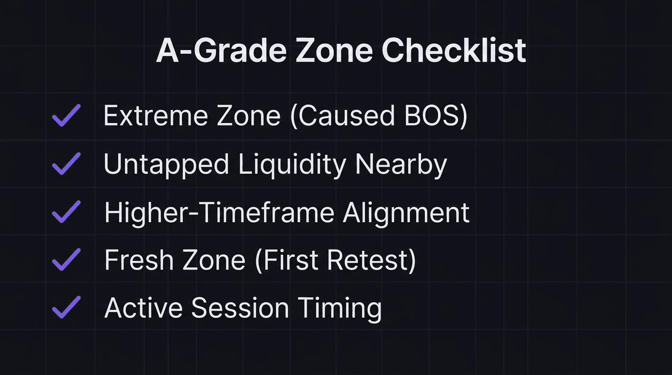
The Confluence Checklist for A-Grade Zones
Before entering any zone-based trade, run through this checklist. Each item adds probability. An A-grade zone checks at least three:
Extreme zone status. Did this zone cause the most recent break of structure? If yes, it is the strongest zone on the chart.
Untapped liquidity nearby. Are there resting orders (above swing highs or below swing lows) within or near the zone that have not been swept? If yes, institutions have fuel available.
Higher-timeframe alignment. Does the higher timeframe agree with the trade direction? A demand zone trade in a higher-timeframe downtrend is lower probability.
Fresh zone. Is this the first retest of the zone? Zones lose strength with each retest because the orders inside them get partially filled.
Active session timing. Is the trade happening during London Open or the London/New York Overlap? Sweeps during dead sessions have lower follow-through.
If a zone checks only one or two boxes, skip it. If it checks four or five, size up your conviction (not your lot size) and wait for the confirmation entry.
What a Failing Zone Looks Like
A trader marks a demand zone at 1.0750 to 1.0765 on EUR/USD. It is the third time price has returned to this zone. There are no swing lows below it (liquidity was already swept on the second test). The higher timeframe is bearish. The trade happens at 11:00 PM EST during the Asian session. Price enters the zone and consolidates for two hours, then breaks below 1.0750 and drops to 1.0710. The zone checked zero boxes on the confluence checklist.
That trader did not have a bad strategy. They had no filter. The checklist would have kept them out.
How EdgeFlo Tracks Zone-Based Entries
EdgeFlo's trading journal lets you tag setup type and confluence count for every trade. Tag entries as "zone + sweep," "zone only," or "zone + sweep + BOS" and review your results after 30 trades. Most traders discover that their zone-only trades have a win rate 15 to 20 percentage points lower than their confluence-stacked trades. That data transforms how you filter setups. Instead of trading every zone, you wait for the ones that check the boxes.
What is the extreme zone in trading?
Why do supply and demand zones fail?
How does liquidity improve a supply or demand zone?
How many confluences should an A-grade zone have?

Turn discipline on.
Every session.
EdgeFlo is the environment serious traders operate inside.
Start 7-Day Trial — $7
Cancel anytime.
No long-term commitment.


Think Different, Trade Different.