

Equity Curve: Read Your Performance Like a Chart
Your equity curve reveals tilt, strategy drift, and edge decay before your P&L does. Learn to read the four key shapes and fix problems early.

Your equity curve is a chart of you. Not the market. Not your strategy on paper. You, executing trades in real conditions, one after another. And most traders never look at it.
They check the P&L number at the bottom of the screen. Green is good, red is bad. But a number tells you where you ended up. The curve tells you how you got there. That difference matters more than most traders realize, because the path reveals whether your next 50 trades will look like your last 50 or fall apart completely.
Every screenshot you take, every journal entry you write, every trade you log builds a record. That record, plotted over time, becomes your equity curve. Reading it properly is one of the highest-leverage skills a trader can develop. Winners track their trades. They journal their trades. The equity curve is where that discipline becomes visible.
TL;DR
Your equity curve reveals tilt, strategy drift, and edge decay long before your P&L number does.
Four common curve shapes each point to a specific problem or confirm you have an edge.
A steady climb followed by a sudden cliff is the classic tilt signature. Catch it at the first slope change.
Weekly reviews catch behavioral issues. Monthly reviews catch edge decay.
Plot your curve by trade count, not calendar time, to remove noise from inactive periods.
What Your Equity Curve Is Telling You
An equity curve plots your cumulative account balance (or cumulative R) on the Y-axis against trade number on the X-axis. Every completed trade adds a data point. String 50 or 100 together and patterns emerge that you would never spot staring at individual results.
The curve answers three questions your P&L number cannot:
Is your edge consistent? A steadily rising curve with small, controlled drawdowns means your trading expectancy is positive and your execution is repeatable. Random spikes and crashes mean something is inconsistent, even if your total number is green.
Are you getting better or worse? Compare the slope of your last 30 trades to the 30 before that. Steeper upward slope means improvement. Flattening means your edge is shrinking. Downward turn means something broke.
Where did you deviate? Every sharp drop or sudden spike on the curve corresponds to specific trades. Those trades deserve your attention. Not the average ones. The outliers.
Think of it like a heart rate monitor. A steady rhythm with minor variation is healthy. Erratic spikes and flatlines are warning signs, even if the patient says they feel fine. Your equity curve works the same way. The shape is the signal.
Four Equity Curve Shapes and What They Mean
After reviewing enough curves, four shapes show up again and again. Each one tells a different story about what is happening under the hood.
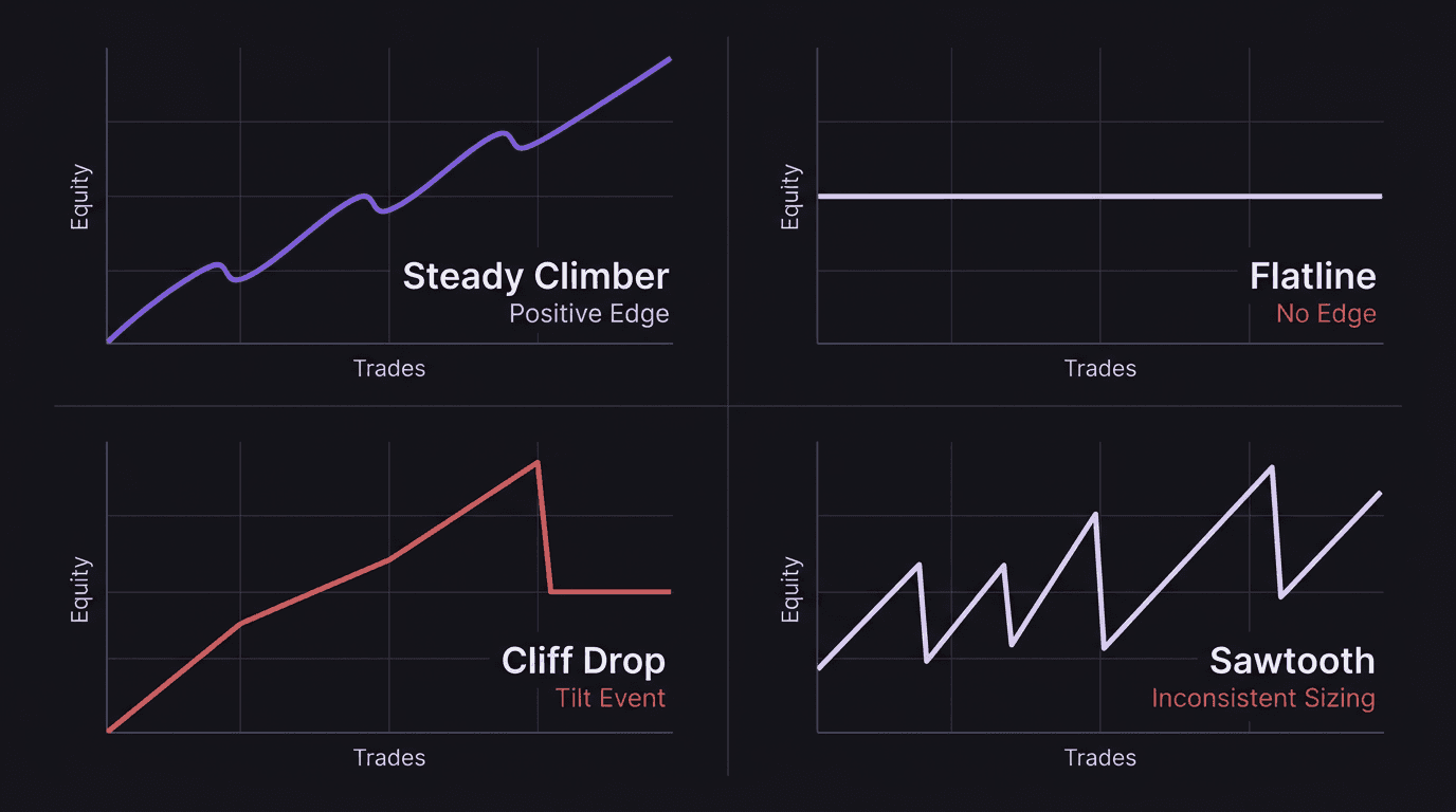
The Steady Climber
A line that moves from lower left to upper right with small, regular pullbacks. Drawdowns stay within a consistent range, usually under 5-8% before recovery.
This is what a positive edge looks like over a meaningful sample. Not exciting. Not dramatic. Just a slightly boring line that trends up. If your curve looks like this over 100+ trades, your job is to protect it. Do not increase size dramatically. Do not switch strategies. The biggest risk to a steady climber is the trader getting bored and overcomplicating things.
The Flatline
Sideways. Not losing much, not making much. Wins and losses cancel each other out over dozens of trades.
This usually means your strategy has near-zero expectancy, or your execution is inconsistent enough to erase whatever edge the strategy has on paper. The fix starts with your trading performance review. Break your trades into categories: which setups won, which lost, and which you took off-plan. Often a flatline trader has one profitable setup buried inside a pile of mediocre ones.
The Cliff Drop
A steady or even impressive climb followed by a sudden, steep drop. The climb might represent 30 or 40 good trades. The drop is 3 to 5 bad ones that give back weeks of progress.
This is the tilt signature. The cliff almost always traces back to revenge trading, oversized positions after a loss, or abandoning rules during a drawdown. It deserves its own breakdown, so we will walk through it in detail below.
The Sawtooth
Sharp up, sharp down, sharp up, sharp down. The curve looks like a saw blade. This is the calling card of inconsistent position sizing. One trade risks 0.5% of the account. The next risks 3%. Winners are small because size was conservative. Losers are big because size was aggressive.
Fix the sizing and the sawtooth often smooths into one of the other three shapes. That alone tells you the strategy has potential but the trader's risk management is undermining it.
Spotting Tilt Before It Becomes a Drawdown
The cliff drop deserves its own section because it is the most common equity curve problem for intermediate traders. You have an edge. You know your setups. But every few weeks, you give back a chunk of profit in a short, violent burst of bad decisions.
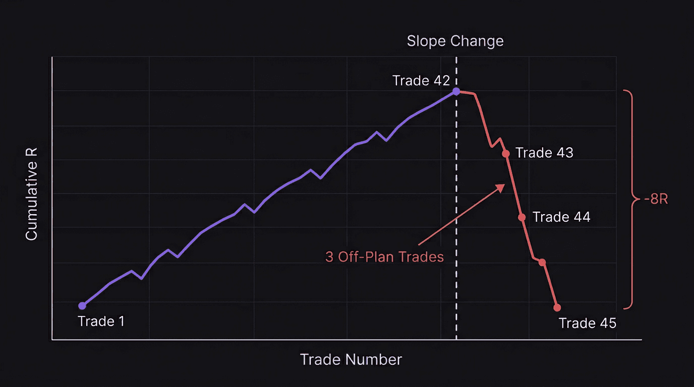
Here is what the pattern looks like, trade by trade.
Walkthrough: The Cliff in Slow Motion
Trade 41: Standard setup on EUR/USD at London open. 1% risk. Hit target for +1.5R. Equity curve ticks up. Running total: +14.2R over 41 trades.
Trade 42: Similar setup on GBP/USD. 1% risk. Stopped out for -1R. Normal loss, part of the plan. Running total: +13.2R.
Trade 43: No setup. Trader enters a "revenge" long on GBP/USD five minutes after the stop-out. Doubles position size to 2%. Stopped out. Running total: +11.2R.
Trade 44: Trader adds to a losing position on the same pair. Now risking 3% on a trade with no plan. Stopped out again. Running total: +8.2R.
Trade 45: One more attempt. 2% risk, no setup, just trying to "get it back." Stopped out. Running total: +6.2R.
Five trades. Three of them were off-plan. The equity curve went from a steady +14.2R climb to +6.2R. That is 8R of damage in three trades, wiping out weeks of disciplined work.
The cliff did not start at Trade 43. It started the moment the trader's emotional state shifted after Trade 42. The equity curve, if reviewed nightly, would have shown the first warning as soon as Trade 43 plotted below the established slope.
This is why tracking matters. Every journal entry, every screenshot, every post-trade note creates a record your equity curve can visualize. You are building a feedback loop. That loop is how you pursue excellence as a lifelong student of the market. Every trade carries a lesson, but only if you have the data to extract it.
The warning signs to watch for on your curve:
Slope change. Your curve was climbing at a steady angle. Suddenly it flattens or dips. Even one trade that breaks the slope deserves a flag.
Cluster of losses. Three or more consecutive losses within a short window, especially if they are larger than your average loss.
Size spike. If you track R-multiple per trade alongside your curve, a sudden jump in risk size paired with a loss is the strongest tilt signal there is.
These are the signals that separate traders who catch tilt at Trade 43 from traders who catch it at Trade 50, after the damage is done. The curve shows it. You just have to look.
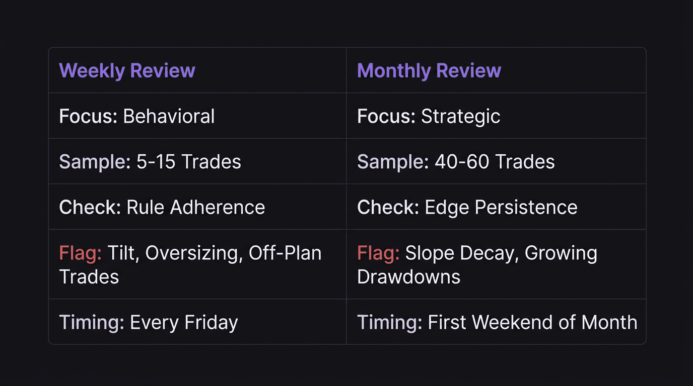
Weekly vs Monthly Reviews (What to Look For)
Two different time horizons. Two different questions. Both use the same equity curve, but they look at different things.
Weekly Review (Every Friday, 15 Minutes)
Your weekly review is behavioral. You are checking whether you followed your rules, not whether the market rewarded you for it.
Pull up your equity curve for the last 5 trading days. Look for:
Any single trade that moved the curve more than 2R in either direction. Flag it. Was the position sized correctly? Was it a planned setup?
Three or more consecutive losses. Did you stop trading after the third, or did you press? The curve shows the answer.
Deviation from slope. If your 20-trade moving slope is positive and this week's segment is flat or negative, investigate before Monday.
The weekly review catches trading mistakes while they are fresh. You remember the context. You remember what you were feeling. That information disappears within a month.
Monthly Review (First Weekend of the Month, 45 Minutes)
Your monthly review is strategic. You have enough data now (typically 20-50 trades for active traders) to evaluate whether your edge still exists.
Look at the last 40 to 60 trades on your curve and ask:
Is the overall slope still positive? If yes, your edge is intact. Protect it.
Has the slope flattened compared to last month? Market conditions may have shifted, or your execution may have drifted.
What is your max drawdown this month versus last? Growing drawdowns with the same strategy suggest something is changing.
Are your best trades coming from one setup or several? If one setup carries all the weight, you are overexposed to a single market condition.
Walkthrough: What a monthly review catches.
Mark trades a breakout strategy on NAS100 on the daily chart. His January equity curve climbed steadily, gaining $2,200 on his $25,000 account (8.8%). February's curve also rose, but only $480 (1.9%).
His win rate both months was identical: 58%. So what changed?
His monthly review reveals the answer: average winner in January was 2.1R, but in February it dropped to 1.2R. He had started taking profits earlier, spooked by a few winners that reversed on him in late January. His trading expectancy fell because he was cutting his best trades short.
The equity curve flagged the problem (flattening slope). The monthly metrics pinpointed the cause (shrinking R). Without both, he would have kept trading a degraded version of his strategy for months.
Plot your curve by trade count, not calendar dates. If you took 15 trades in week one and 3 in week four, calendar-based plotting makes week four look artificially stable. Trade-count plotting gives you the real picture.
This is where the backtesting dashboards and journals pay off. Every trade you tracked during the month feeds this review. Without the data, you are guessing. With it, you are reading.
How EdgeFlo Visualizes Your Equity Curve
Reading your equity curve only works if you can actually see it. Most traders build spreadsheets, plot charts manually, or scroll through broker statements trying to piece the picture together. Tedious enough that most people stop doing it after a few weeks.
EdgeFlo's trading dashboard plots your equity curve automatically from your logged trades. Every completed trade adds a point. The curve updates alongside your core performance metrics: win rate, avg R, profit factor, and EdgeScore. No CSV exports. No spreadsheet formulas. Every trade you log feeds straight into the curve.
The discipline summary sits next to your equity curve, connecting behavior to results on the same timeline. When a section of your curve dips, you can cross-reference it with your rule adherence for that same period. Did you break position sizing rules? Skip your pre-trade checklist? Take setups outside your playbook? The data is right there, tied to the same trades that moved the curve. That feedback loop is what turns a performance chart into a tool for actual improvement.
The Edge Brief
Receive Insights on trading psychology, discipline, and the behavioral patterns that create consistent traders from our Founder and the EdgeFlo team, delivered to your inbox.
Think different. Trade different.
How often should I review my equity curve?
What does a flat equity curve mean?
Can an equity curve tell me if my strategy is broken?
What is the difference between an equity curve and a P&L statement?

Turn discipline on.
Every session.
EdgeFlo is the environment serious traders operate inside.
Start 7-Day Trial — $7
Cancel anytime.
No long-term commitment.


Think Different, Trade Different.